
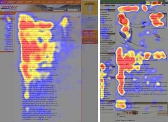
Understand your audience's reading patterns
Whoever you are, and wherever you are in the world, we all read content from top to bottom. And in the western world, we tend to read content from left to right. But it doesn’t stop there. Users tend to scan pieces of content before they commit to reading it, allowing them to get a sense of whether or not it appeals to them. And these scanning patterns usually take one of two shapes – “F” and “Z”.
Understanding how audiences visually digest content is what helps graphic designers to create impactful content that engages and, particularly in the case of landing pages, converts.
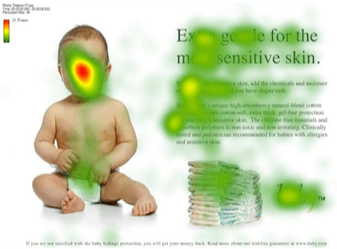
The impact of size on visibility
Size plays a pretty important role in visual hierarchy. And you’ll be unsurprised to hear that users tend to read the bigger bits first.
The size of an element indicates how important it is to the reader. So the bigger an element is, the more likely your audience is to look at it first.
Take this example from the new campaign identity we developed for the University of Central Lancashire’s 2022 student recruitment campaign:
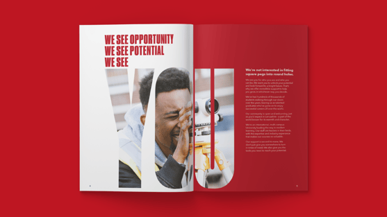
Our campaign concept – ‘We see YOU’ – places the focus on the individual that’s being targeted, i.e. a potential student. So with this in mind, we made ‘YOU’ our primary focus in the design to make sure that the audience would immediately be able to relate to the piece and want to read on to find out more.
Give content space to breathe
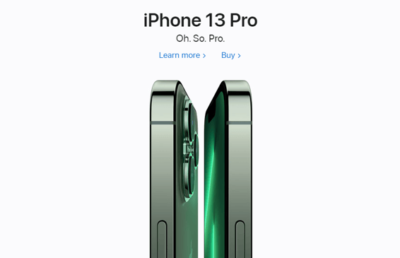
White space is a really important and often overlooked tool in graphic design. It simply refers to the empty space within a design that allows your content to breathe. A brand who gets this right pretty much every time is Apple.
White space helps to distinguish your elements from one another, therefore helping the more important ones to stand out. It’s particularly important to leave white space around the clickable elements of your design like buttons, as this will make these elements easier for users to identify and interact with.
Capture attention with colour and contrast
Colour plays an important role in drawing attention in design. And you won’t be surprised when we say that bright colours stand out more than duller or muted tones. Just take this striking example from Spotify:
By using just two bold and contrasting hues, the audience’s attention is immediately grabbed. It’s important to be careful with your colour selection as a design that uses too many contrasting colours will most likely look disorganized and incohesive. So be selective with your colours, and make sure your combination adheres to colour theory. And most importantly, make sure your colour contrasts conform to accessibility requirements - find out more about this in our free accessible design eBook.
Visual hierarchy is as much a science as it is an art. Many graphic designers will spend years perfecting their design skills by applying these principles.
If you’re looking for support with narrowing down what you want your design to focus on and considering your audiences needs in the process, get in touch and we can help create designs that generate impact.
Originally published:
July 21, 2022
Updated:
December 20, 2023